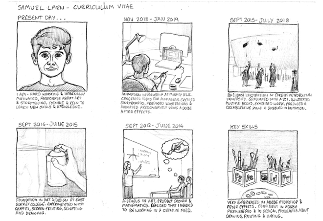
PDP
For the Exposure module I produced an illustrated book looking at a dystopian future in which people exist within simulated realities, and there is no certainty as to which level of consciousness is original. I also wrote, produced and illustrated for three editions of a zine showcasing student work. I have included in my Exposure submission a copy of my dissertation, for which I designed a cover and produced as a book, which could be useful for future portfolios of my work.
Overall I am happy with my book Silicon Existence. My objective with the project was to create illustrations that portrayed virtual reality in a mysterious, eerie and dark manner. This idea came from watching films such as Blade Runner, 1984, 2001: A Space Odyssey, The Matrix and particularly the TV show Black Mirror. All of these sources of inspiration tackle future technologies and design fiction by creating a dystopian setting. Whilst being perhaps more entertaining than a light hearted excursion to the future, this allows serious questions about the ethics and consequences of technologies of the future to be asked. I have studied design fiction and technological trends and I know that often ideas featured in films like these do end up resembling future reality. This is why I wanted to tackle virtual reality in this project, and why I chose to depict it as a bleak, moody version of the future. I believe that it has the potential to completely confuse simulation from reality, although no one can ever be fully qualified to dictate what reality is in the first place, and reality is independent to each individual. The whole topic is inexhaustibly confusing and that is why I find it so fascinating.
If I could go back and change anything about Silicon Existence I think it would be to extend the narrative and fleshing it out with more events. The finished product was 32 pages including the covers. I think that there is potential to really add to the plot and create a much longer story, with more complex characters. This is something that I am strongly considering working on after graduating, and possibly trying to get published as a first professional book.
In my opinion the zines were a success. The objective from the start was to share a collection of illustration student’s work together cohesively. In total I managed to hassle 15 illustration students, and three writers external to the university to produce something for one or more of the three zines, which was a better result than anticipated from the start. I think that even more students would have contributed had it not been for upcoming important deadlines. Many other students expressed interest but couldn’t find the time to work on another project.
I originally wanted to produce one zine a week for a longer period of time than I did. The first edition took one week to curate and produce, but the following ones took two weeks each as it was difficult to get everyone to stick to the deadlines. I think that it is certainly possible to set up all the tasks for the zine in a more efficient way, and to get more people on board to help edit, and it could be made into a weekly publication. This is something I might try and organise in the future now that I know exactly what needs doing, and now that other students will have more free time on their hands.
I received some useful advice through critique on all of my Exposure projects. Some of the key points raised through feedback sessions that I considered whilst working on Silicon Existence include: creating grids in InDesign to use as the basis for aligning images; breaking away from the catalogue style uniform images and allowing some bits of the work to spread right across a page; thoroughly checking image resolutions and never assuming they are 300 dpi when they have been saved multiple times, a mistake that I would have made without help from tutors; and, perhaps most importantly, being creative with the flow of each page. It is not enough to spend a lot of time creating the images and then leaving them to stand alone on each page. How one page feeds into the next is key to creating the atmosphere and progressing the story in a book.
Exposure as a whole has developed my understanding of how to present work in a more professional way, and to have more confidence in doing so. Before third year I was far less inclined to show people my work, whereas now I have created my own website, and regularly post illustration work to social media. Through producing better quality projects with the guidance of tutors and peers I have really gained a desire to show work to the world, and hopefully to get some commissions in the future as a result.
Silicon Existence
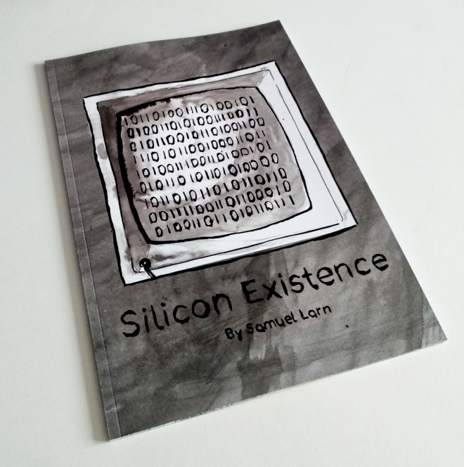 Now that I can see the physical result of this project I am pleased with how it came out. It is hard to judge the quality of a book by looking at it on screen.
What went well? I think that the book portrays the moody/dark atmosphere as was intended with this project. I am really happy with how the story flows from page to page, and how it goes from light to dark at key moments to juxtapose the image. I am happy with my choice of papers for the book. The covers are a silk paper with a smooth, quality feel. The text is a raw paper finish, which is hard to tell on the pages covered in ink, but feels great as you turn the pages. I received the last minute advice to make my book bigger. It was originally going to be 140mmx200mm which, now that I have the 200mmx280mm version I think would have been too small, as it feels and looks right this size.
What could have been better? In retrospect it would have been nice to have made it with hardback covers. I would have needed to add more pages overall, and so this would have had to have been an earlier made decision, but I think the overall quality of the book would have seemed higher had I made it hardback. This is something to think about for future book illustration projects.
PDP
I started out level six with some idea of the directions I wanted to explore with my work. The process of researching for my dissertation fed me with a variety of ideas surrounding technology and the future. My first inclination was to generate some ideas for future technologies that would improve the world. I came up with the idea for a Water Bottle Tree. The Water Bottle Tree is a bioengineered tree that absorbs waste plastics from litter (in a future where we still haven’t solved our waste problems) and forms plastic bottles at the end of its branches. It fills these with excess water that it can draw from deep underground, and provides a pick-able water source for thirsty people. I had some fun coming up with ideas like this, but soon realized that my ideas would lack a solid foundation in technological possibility, being a student of illustration and not science, engineering or product design. After receiving critique from tutors, I decided that it could be more interesting to focus on existing speculation into future technologies, and to think about the dystopian possibilities, not the utopian.
My main influences for the resulting project were The Wachowski brothers (directors of The Matrix) Charlie Brooker (creator of the Black Mirror series) and Ridley Scott (Blade Runner). Initially I had looked at The Handmaids Tale, Bruce Miller’s TV adaption of Margaret Atwood’s novel, which gave me ideas about people’s attitudes and relationships in a dystopian future. I watched Michael Radford’s film adaption of Nineteen Eighty Four which also gave me an insight into ideas like social conditioning and extreme authoritarianism. I decided that the fictional worlds that focused more heavily on technology of the future interested me more, and decided to pursue this idea for my project.
I looked at the work of several illustrators and artists as visual influence for my development of work throughout Encounter. The Depository by Andrzej Klimowski remains one of my favourite illustrated books and gave me the idea to exclude text and create a narrative told entirely through images. His black ink illustrations also influenced my choice of media. David Hockney’s illustrations for the Grimm’s Fairy Tales were a strong example how to create an eerie atmosphere, as were many of the projects of Anke Feuchtenberger whose black and white images both intrigue me and scare me a little.
I think that the process of creating, and re-creating images with ink and brushes throughout this module has been one of the most beneficial aspects of it. Ink is a medium that I wasn’t familiar with before this year but I can now confidently say it is one of my favorite to use, and I think that it was the most appropriate for my Silicon Existence book. In addition to creating work directly for projects I also drew daily, often with ink, as a way of improving my ability to use it. I have included examples of these drawings in the personal work section of my blog.
As highlighted in a crit, I think that a weak point of my encounter work was drawing characters consistently, and making them uniquely recognizable. My two character for Silicon Existence both looked very similar, partly due to them being based on my two sisters who share some features. The way I drew them could have exaggerated some minor differences to help distinguish between them better. I drew one of them in black clothing and the other in light grey, but in certain images where stronger light was an important feature they looked very similar tonally. I also decided myself that figure drawing and portraiture were weak points in my practice, and so I have since been drawing faces and figures every day to strengthen this area.
I am happy with how my work has developed and I think it has started to achieve what I wanted it to from the beginning of the year. I have always appreciated illustrators who can create atmosphere in their work, through strong light and dark shadows with interesting compositions. I think that I am on the way to being capable of creating atmospheric images, applying the same key factors to my own work. Encounter has developed my image making ability quite considerably when looking at illustrations I produced at the start of the year compared to work produced nearer to the end.
Infographic commission


I received another commission recently to produce an infographic piece for a journalism project.
The client was a masters student at Cardiff university who had seen my Instagram page and subsequently contacted me.
The illustrations were for an economic presentation which discussed the movement of money between banks, corporations, the government and depositors.
Professional practice
Throughout third year we have had a series of professional practice seminars, which have been extremely useful.
The topics covered included: how to price your work; how to write up invoices and conduct yourself as a business with clients; networking; where to begin as a freelance illustrator, looking at agencies as an option.
In addition we were recommended several books to read for extra advice on becoming a professional person in the illustration industry. I have read Fig Taylor’s book How to create a portfolio and get hired. She is a portfolio consultant for the association of illustrators and so she had many valuable tips.
I am currently reading Darrel Rees’ book How to be an illustrator and I hope to keep absorbing useful information to take forward after graduation.
One of the key points that I have learnt throughout professional practice is to have some specificity when designing a portfolio for certain clients or employers. I am interested in editorial illustration and so I have started to target my digital portfolio for this industry by editing my work into relating articles, although not too often as this could come across as a little gimmicky. I haven’t received any actual commissions for editorial work yet, and so until I do I want to show that I have thought about some of my work in this context.
Protected: Professional practice
Appling colour to portraits digitally


I have started to add some colour to my daily portraits, using Photoshop to edit the original China Marker and Ink pen drawings.
It has been an interesting process that allows me to give another dimension to the work and to think more about colour use and colour theory. I usually try to include complementary colours and subtle tonal differences to suggest shape and lighting, but have experimented with flatter colours too.
I think that some of them are starting to look more like screen prints. Screen printing is a process that I have used in the past, mostly on my foundation course, but haven’t returned to in recent years. As I produce more and more of this kind of work I am building up a base of ideas which I might take forward and screen print in the future.
I have been partly inspired by some big name artists like Andy Warhol, but also more contemporary practitioners like illustrator Malika Favre who produces incredibly colourful and visually stunning portraits. She also makes a lot of her work into GIFs for her professional website, and that is something I think I would like to experiment with myself.
Storyboard commission


I received a commission to produce a storyboard for a short film. The client was a third year Media Production student at Bournemouth University, and somebody I know from my sixth form college.
The film was about two skateboarders who are manipulated by a wanted criminal into committing a murder. They are unaware of the case against the other character, and go along with what he tells them to do, as young teenagers tend to do. They are initially somewhat suspicious of him, but after consuming alcohol and drugs they allow themselves to become a part of his plan to deal with a witness in a rape case against him.
The story is a somewhat gloomy one which builds up towards the pivotal moment, keeping the viewer in the dark until the big reveal.
I decided to produce the sketches in coloured pencil. This allowed me to produce each frame quite quickly and focus on progressing the narrative. Once I had scanned and imported the images into Photoshop I decided that a black and white edit was appropriate. The dark story calls for dark images and as the work is functioning as a storyboard I decided that colour might just add a layer of distraction from the series of events.
I used what I’ve learnt about composition and the use of greyscale from studying artists like Andrej Klimowski, David Hockney and Bill Bragg, and applied these ideas to this project, although in a more basic way to keep the turnover of work at a good pace.
I enjoyed working on this project because it was something a little different from the norm. I haven’t worked on such a large number of illustrations for one project before, 64 in total, and so doing each one quickly was key. This was an unpaid commission and I also didn’t want it to interfere with my own projects at University.
Portrait practice


In addition to my daily object drawing I decided to start a sketchbook doing a daily portrait. When I browse through other illustrators work the pieces I often gravitate towards are portrait illustrations. Drawing a portrait and capturing something about the subject is a very difficult skill, one that can take years to develop. It is, in my opinion, one of my weaker areas and this is the reason I have decided to practice it every day.
My subjects are usually someone who has featured in the news recently, a radio show or podcast host or guest, an author of a book I’ve read or am reading or sometimes a musician/artist I have listened to recently. Consequently none of them are drawn from life which means that life drawing is still an area to work on separately. In the meantime working from photos allows me as much time as I want with each subject to figure out face shapes, expressions and other characteristics to include in my portrait drawing.
